
Funduro Low -Stress Routes
Funduro Low-Stress Routes is a navigational app that finds safe routes for cyclists in cities with little bike infrastructure. Their goal is to get more people on their bikes while feeling and being safe. With this goal in mind, finding routes that have little traffic or bike lanes will give cyclists more confidence to ride on the street and choose to take their bike instead of their car to run errands, meet friends, or explore their neighborhood.
About funduro
Funduro is here for the cycling community to create a safe riding experience by providing safe routes to cyclists who want to get out on their bikes more. The hope that the more people are out riding the more positive experiences they have will encourage them to keep riding.
Project Information
Timeline: 16 Weeks | My Role: Research, User Testing, User Interviews, UI/UX Design, Brand Identity, and Prototyping | Tools: Adobe Illustrator, Figma, Miro, Marvel POP
The Problem Space
Finding safe cycling routes in cities with limited bike infrastructure is a challenge for every cyclist. When they first start to ride bikes more, most people don’t have the network to ask where the safe routes are. Often this discourages people from going out to explore. Having an app that would help them find those routes when they are first starting out in a new city or just getting into road riding is critical to getting people started. I’ve found women tend to be the ones that are less likely to ride in the street because of their interactions with aggressive drivers. I found that if there were an app that gave you access to safe routes to your destinations that people would be willing to ride their bikes more. This would create more bike-positive communities which in turn, get proper infrastructure built.
“ I think there’s a gulf between feeling safe and actually being safe. And I think it’s important that our streets feel safe. Like it’s not enough for them to actually be safe, they also have to feel safe.”
Step 1: Secondary Research
I needed to make sure that there was a need for an app like this and test my theory that cyclists won’t ride in streets without safe routes in cities without safe bike infrastructure to increase people riding. From this research, I found several articles supporting my theory.
Step 2: User Interviews
I first developed a screener survey to know who to interview. Based on their results I interviewed six different people and asked them about their experience of riding in the city and what they would look for when searching for a route. Most folks said they didn’t feel safe riding on the streets. Most of these responses were due to a lack of bike positivity in cities. However, this didn’t stop them from riding their bikes, they just didn’t ride as much as they would have liked. From their interviews, I gathered what features would be best for this app. My participants were folks who rode regularly or commuted. Some folks had a network of people to ask about routes and a few did not. I interviewed 2 women, 1 non-binary, and 2 men. I did a screener survey to recruit these folks and pulled them from my network of folks in the bike community in Cincinnati. One of the participants lives in Oakland, California which has decent bike infrastructure, and shared how they feel being on the road there. These folks shared some great insights. The statement above was an ah-ha moment for me and really helped me shape the language around this problem. I needed to make sure that feeling and being safe go hand in hand when is comes to being confident on the road. Most people stick with trails or gravel riding because they don’t know if they are going to come back from a ride safely.
Step 3: Affinity Map of Themes
After conducting and dissecting my interviews, I when through each interview transcript and found the following themes throughout their answers.
Major Themes
Safety
Community
Routes
Infrastructure
Education
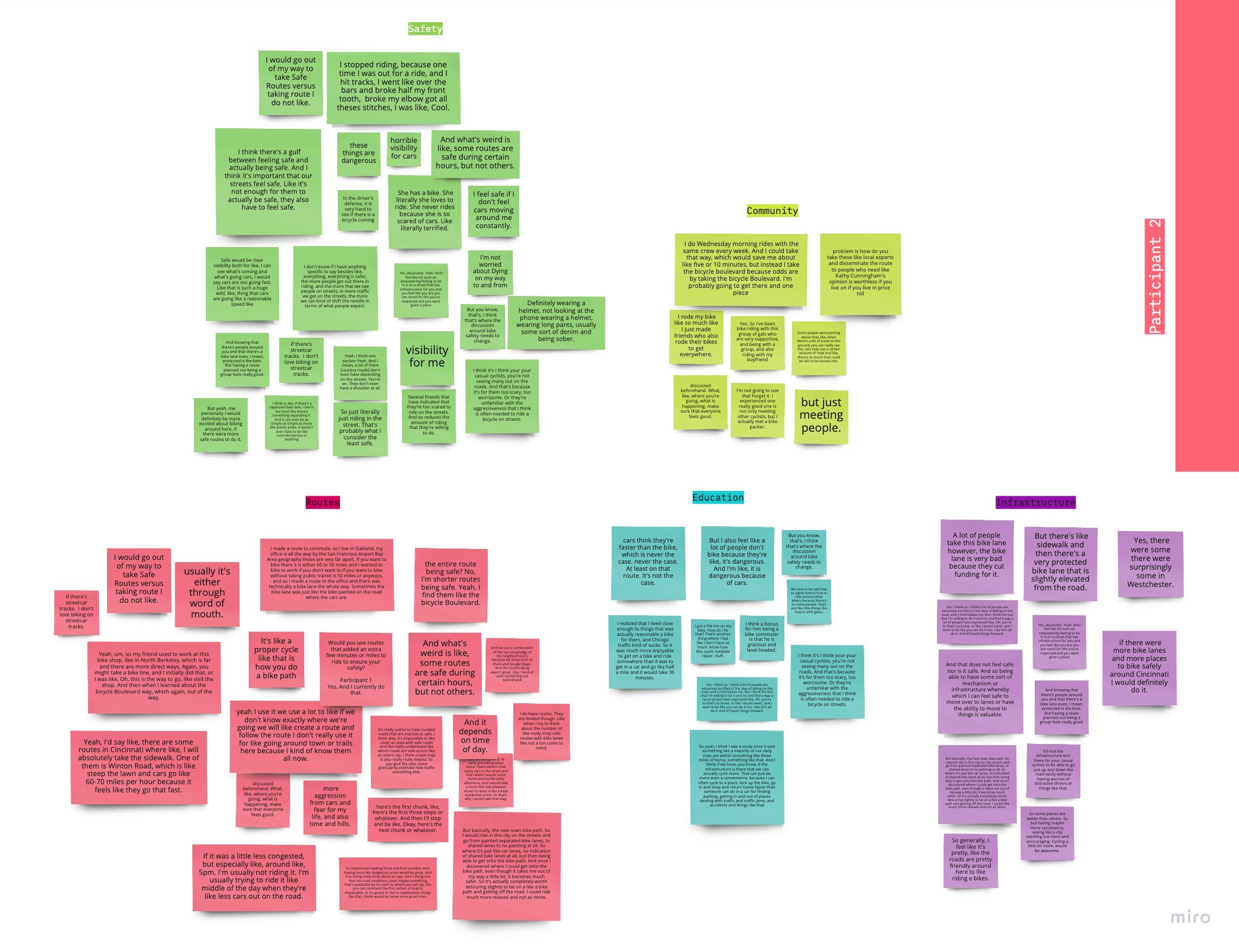
Of these five common themes based on user interviews, I added as many of those as I could to the first rollout of the app. Infrastructure conversations were great to have but this app’s goal wasn’t to create infrastructure changes. The goal is to get more people on bikes so that infrastructure in cities can change later. In many of my secondary research findings, all those folks said that if the city builds it, people will use it. That is true across the board here including streets that don’t necessarily have the best. I went ahead and chose Safety, Routes, and Community as the three main themes I would roll out with this version of the app. Time didn’t permit for an expansive education side to this app but I hope in the future that this would be added in new versions.
Step 4: Jobs to Be Done
I chose the JTBD method for this project because I felt that the problem, we were trying to solve was more focused on finding a clear solution than completing a series of tasks. This method worked better for my project because of the results of my interviews. The way to solve the solution of getting more people on bikes requires more focus on the types of features that my audience needs. Based on this research every person has the same pain points and based on the information they provided me for who they are, they are a distinct audience. All the people I chatted with have the same feelings about riding on the street, how they feel about the infrastructure of the city and how they’d cycle more if they knew of safer ways to get around.
I didn’t feel that Empathy maps or personas were the strongest solutions for me in synthesizing my data.
To the right are the jobs and needs of my user.

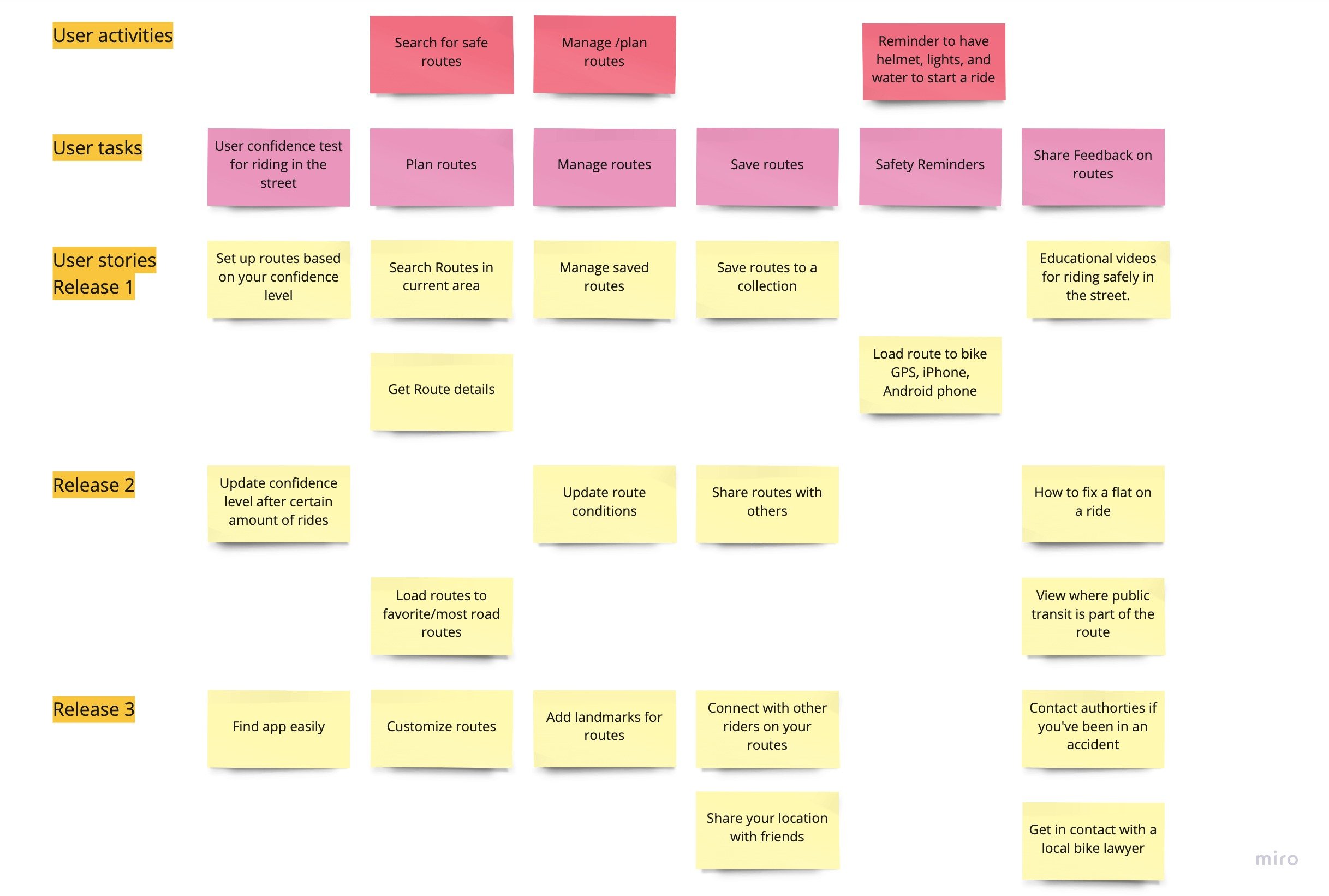
Step 5: User Story Map
Mapping User Stories is the way I determined the MVP (Minimum Viable Product) for Funduro. I did this by mapping out the story my user. I went back and reviewed my interview transcripts and JtBD to determine the activities and tasks for my user. The critical features I found are:
User Safety Survey
Search for Routes
Managing Routes
Save Routes
Safety Reminders
Share Feedback on Routes
Ideation
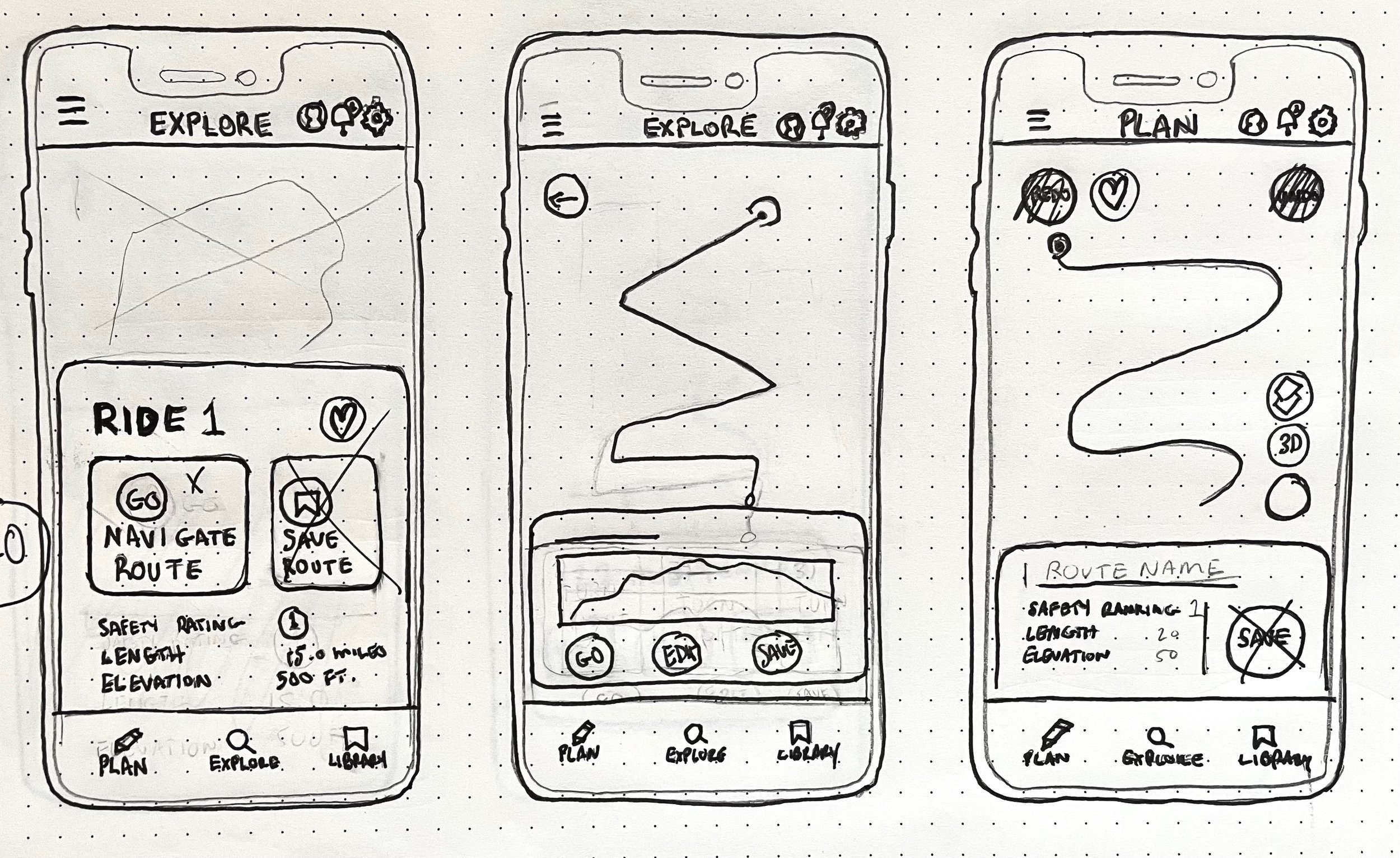
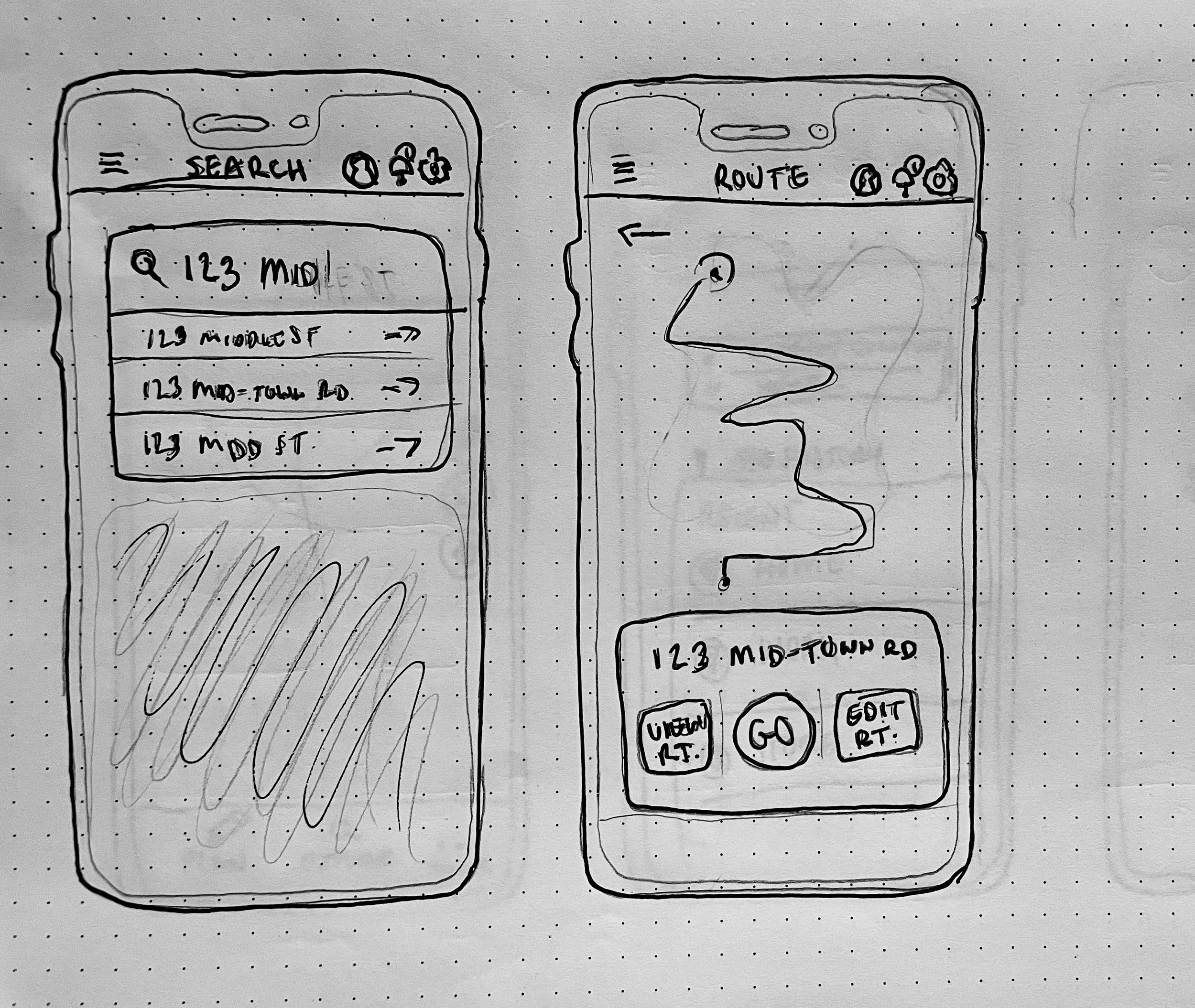
After conducting user interviews and working through JtBD method, I moved on to the sketching process. Sketching allowed me to visualize how a user would be working through the screens and filter ideas that could be included in the wireframes like:
Safety Survey
Search for routes via, the search bar or saved rides
View detailed route information
Explore Routes
Save Routes


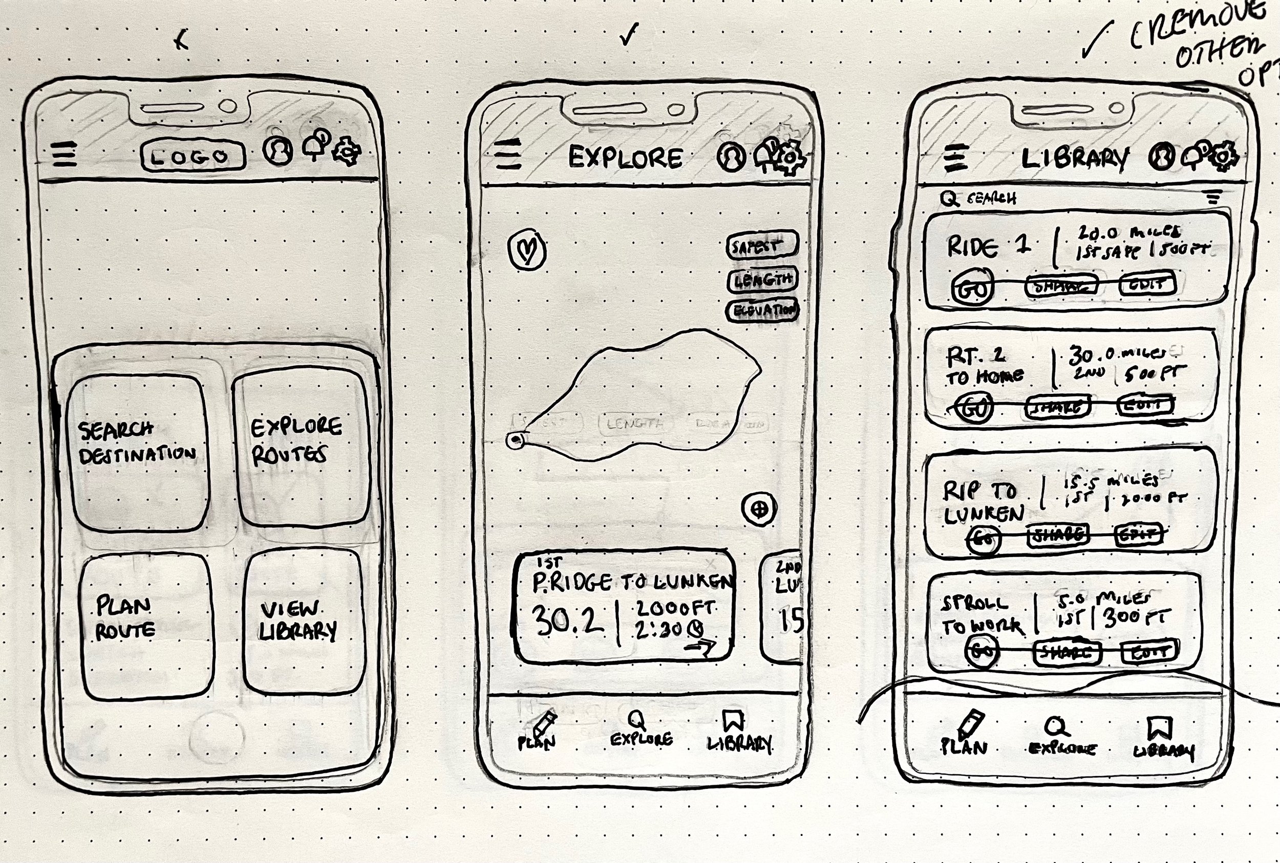
Step 1: Guerilla User Testing
After sketching these mockups, I used Marvel POP to create a working prototype to test with people. This was a fun exercise and helped me watch how a user interacts with products. Most of the screens I sketched were intuitive enough that users felt secure interacting with the product. Since these wouldn’t be my final users, it was a great exercise to see if I were on the right track. Key takeaways from this process were, that some of my design choices needed some refining, i.e. some buttons felt redundant to users and needed to be fixed.
Step 2: User Flow Mapping
User flows are an important part of the UX process. I needed to make sure that I understood how the user was going to flow through the screens. This meant my focus here was two things:
Create flows that establish how each critical feature would be used.
Create an experience for the user that was simple, easy, and efficient as possible.
These user flows did change in the end however, they were enough to get me to design the low-fidelity prototypes that I used for user testing.

Design
Step 1: Logo + Style Guide
The first phase of the design process for me was creating a logo for the app. Funduro is a slang term for a long, fun ride, in the cycling community.
Funduro is here for the cycling community to create a safe riding experience by providing safe routes to cyclists who want to get out on their bikes more. The hope is that the more people are out riding the more positive experiences they have will encourage them to keep riding.
Brand Attributes
Fun
Trustworthy
Safety-Driven
After defining this for Funduro, I moved on to create a logo with these things in mind. I sketched about twenty-five different logos.


I wanted to have a human attribute to this logo as well as showing that it’s for cyclists. I chose the typeface because it’s strong and has a sense of safety when you look at it. The colors were selected based on the brand attributes. Blue is the primary color for this brand because it makes users feel calm or safe. Purple is often connected to power, making users feel confident when riding. Orange can call feelings of excitement when looking at it, we want cyclists to feel excited when they ride which will allow them to have fun on their rides.
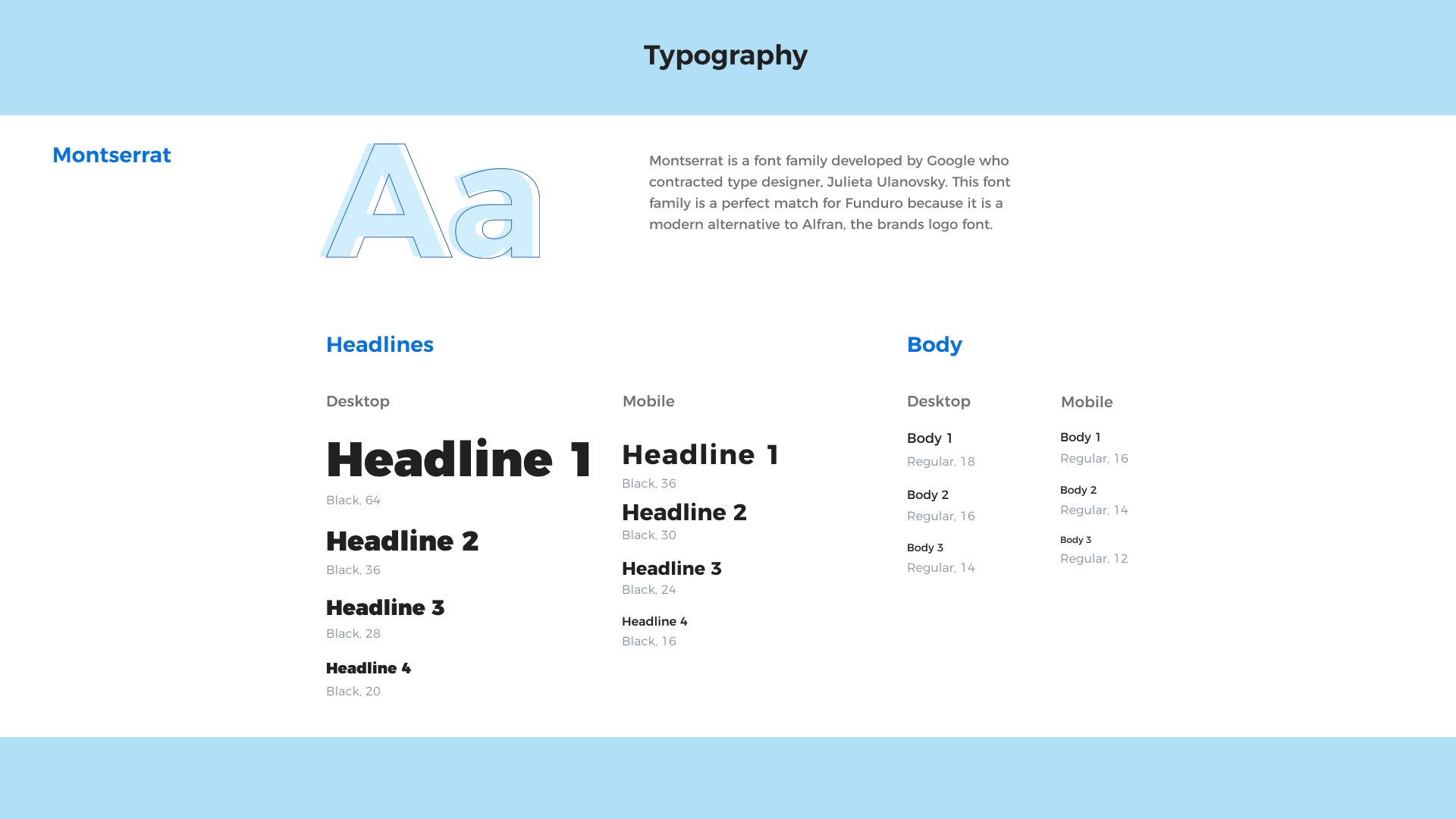
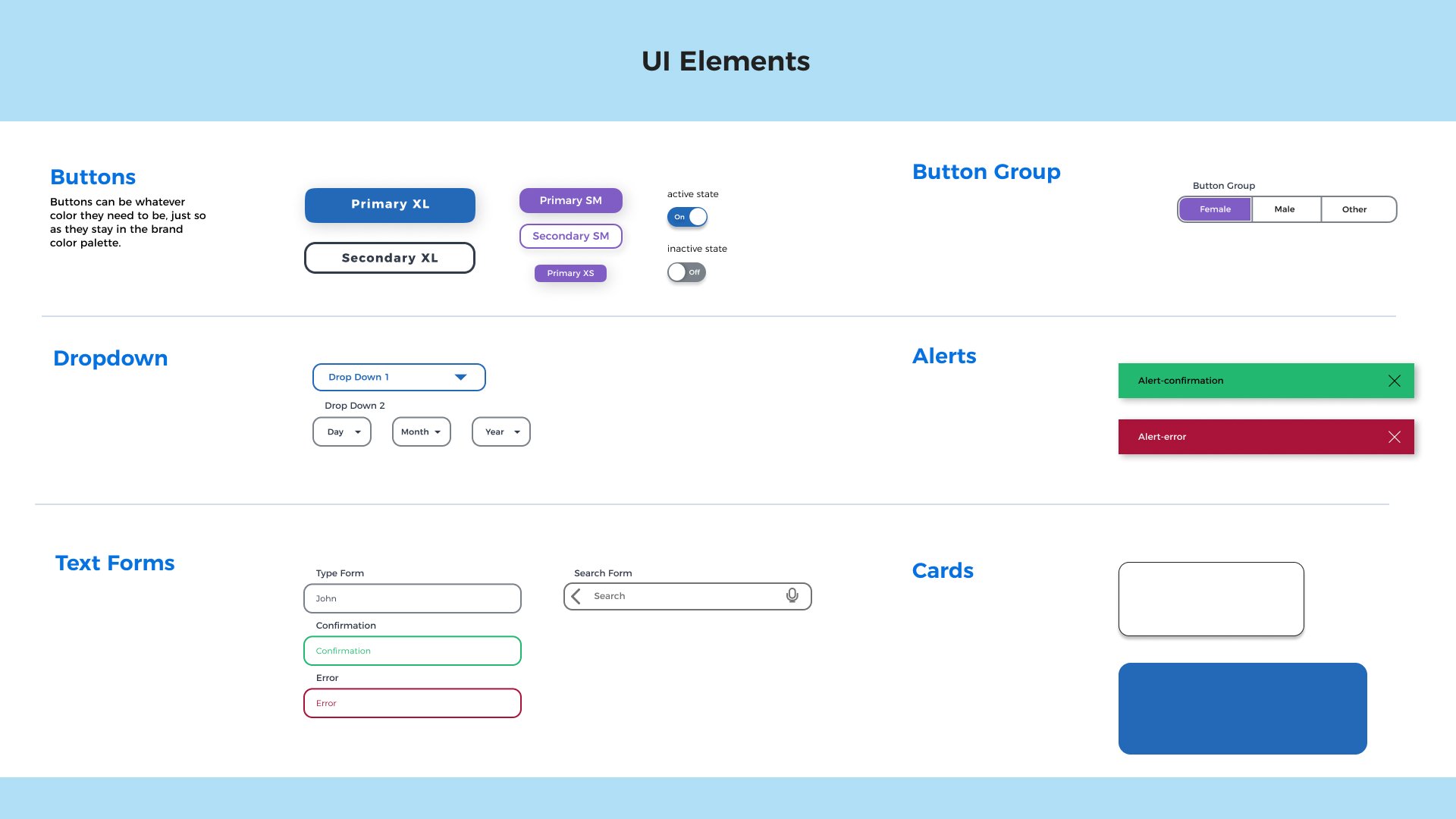
The style guide was helpful when developing standards for the high-fidelity prototypes which we will walk through momentarily.

Step 2: Low-Fi Prototype
After fixing the sketches from feedback from my guerilla user testing phase, I moved into the low-fi prototype phase. During this phase, I began to define the feel of the app and focused on making sure the app would function easily for my users. Going from sketches on paper to digital screens made this project really come to life for me. While I was building the lo-fi prototypes, I made sure that the features from the sketches that made the app easy to use were still there while making sure that it was easy to use and didn’t lose too much from the sketches.


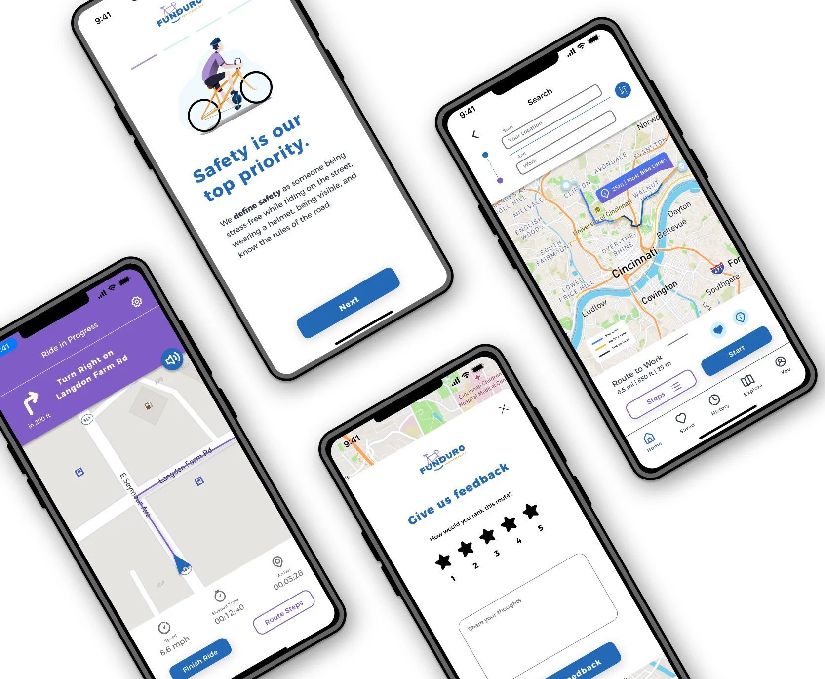
Step 3: High Fidelity Prototypes
Once I reviewed the low-fi prototypes and made changes to the red routes, I started to apply the elements from the style guide. This included images, colors, fonts, and UI elements. I wanted to make sure that the addition of these things didn’t change how the user will use the product. A well-designed product that follows style guidelines is important, but it should never be more important than how the user will interact with it.


Step 4: User Testing
Once the Hi-fi prototypes where finished I began testing users. Over the course of 2 weeks I conducted tests with 10 different users. I conducted a few of the tests remotely but most of them were in-person. After the first few tests it became clear what needed the most attention.


Safety Definition: 90% of users commented that there is no definition of safety. While safety is subjective to individual users, I needed to make it clear. My solution was to put it at the beginning of the survey to help users understand the definition before filling out the safety survey.

Route Color Codes: 80% of users pointed out that they didn’t understand the colors of the routes. I went with telling the users which ones had the most bike lanes. This was something that users could easily rely on and could decide on their own if they wanted to use it.

Ability to leave feedback on routes: 80% of users wanted the option to leave their feedback once finished with a route. This would allow users to provide the Funduro team with up-to-date comments on the route. These helps keep the routes current and helpful for future users.

History of Past Rides: Users also wanted a way to see their history of rides in case they wanted to save a route they found on the explore page. Some didn’t want to add it their saved list until after they used the route. Having a history of rides allow users to easily return to routes to save or modify for future rides.

Explain Collection of Data at the beginning: At the beginning of the Account creation step, I don’t have an explanation of why I’m collecting data. I created a brief explanation of what the information is being used for to provide more context to the user signing up for an account.
Project Reflection
Outcomes
Funduro delivered its promise to get cyclists to get to their destinations safely. While I believe the project could have gone through another round of testing to tweak it a little more, this final product is a great start to getting more people out on bikes and feeling and being safe while on rides.
“For someone who doesn’t have the network and wants to find safe routes to ride, this is the perfect resource for them.”
Lessons
Some key things I learned from this project were:
Remember the main Goal
I wish I had tested the wireframes earlier than the high-fidelity phase. I said that my main goal was safety, yet users felt that it got lost in the mix of the project. I learned that after the first test I didn’t give a clear definition of safety for the app itself. It could have also been highlighted a few times to really get that to show through. I do believe having another round of testing with some key safety definitions highlighted in the beginning, when searching for a ride and starting a ride to really highlight that safety aspect would have made this stronger.
I’m not designing an app for me
Since I am someone in my target audience, I caught myself designing an app that I would use. I didn’t think about the users as often as I wanted to. While I think it’s a strength that I am part of my target audience, I needed to go back and look at my user interviews and remember they are my target audience, not just myself.
Don’t get caught up in the details early
I’ve been designing for a while now and have learned from my time in packaging design to not get caught up in the tiny details so early in the design phase. When designing this app, I spent a lot of time getting everything perfectly aligned and went back to undo something when I had an extra line of text or a new element that I didn’t keep in mind until I was on the next screen. I have learned to just get it all in and revise once the big elements are solved.