Cycle-Wise
Cycle-Wise is a e-commerce site helping cyclists purchase the right bicycle, bicycle parts, and cycling gear.

About cycle-Wise
Cycle-Wise is an online retailer of high-end bicycles, bicycle parts, and gear. Their target demographic is 72% males between the ages of 24–38 years old with high incomes. These users are willing to spend money on this hobby because they see it as an investment. They will spend a lot of time researching the bike they are looking to purchase because they want to ensure this will allow them to meet their athletic goals. Cycle-Wise was founded by professional cyclists who are passionate about getting cyclists on a bike that they feel confident about.
Project information
Timeline: 6 weeks | My Role: Researcher, Designer, User Testing, UX/UI Design, Brand Identity and Prototyping | Tools: Adobe Illustrator, Figma, Miro
The Problem Space
PM has shared data that shows 50% of users open on average 7 item pages and then abandon the site without moving any items into the cart. Additionally, 70% of users who place an item in the cart do not purchase. Data shows that users abandon the cart at the registration page. Cycle-Wise PM proposed two solutions to explore: users are unable to determine which bike is best based on relative features and guest checkout must capture email.
Phase 1: Discovery
Developing a plan.
Since I knew I only had 90 hours to complete the project I needed a plan that I knew I could follow to complete it within that timeline. To achieve this, I created a project plan that broke up the project into six phases. In my project plan, I needed to make sure that all phases were timed correctly, or I would go over the allotted time. The timeline was altered a bit because I was out having issues finding the best candidates and I feel ill. However, during the project, there were sections I spent less time on than I thought I would, and carried that over to the design phases to make sure I had ample time to complete it.

Secondary Research
Competitor Analysis
I researched Cycle-Wise’s 3 main competitors. I spent time diving into their websites as it relates to the project. I walked through product pages and checkout processes as started. A manufacturer had more photos and in-depth information on their products vs. a retail or third-party seller. The third-party seller, Competitive Cyclist, was more focused on selling bicycle parts and gear. They had a decent number of images, but they lacked the personality of those I found on Trek and Canyon Bicycles site.
When walking through the checkout process on each of the sites, each had a similar process of adding a product to the cart.
Trek Bikes
Trek is a bike manufacturer in Madison, WI. They have retail stores nationwide. I found the flow of purchasing a bike easy. Most notable thing is the questionnaire to finding the right bike for the customer. Their checkout process was very easy to go through. You didn’t need to create an account with them however, if you did a return shipping was free to a person with a Trek account.
Competitive Cyclist
Competitive Cyclist is a third-party seller. They have several brands of bicycles that they sell. No entry-level bicycles are found here you’ll find mid-level bikes and up. I didn’t like having to enter all my information to check out. It took a long time to go through. The bike fit calculator was an excellent addition to their site. No cookie-cutter bike fitting here. I wish this was highlighted earlier in the researching process.
Canyon
Canyon is also a bike manufacturer based in the UK. You can only purchase online in the US. A few things that set them apart from the other two competitors you could checkout without making an account at all. It wasn’t even an option All the user had to do was input their email and they were on their way to purchasing their bike. I liked the questionnaire as well.
The takeaway
Once I completed the analysis of each competitor my three takeaways were:
Give as much information about the product as possible.
Make the bike fit the first action item the user sees.
Checkout must be quick and simple, keep it short and in stages.
User Interviews
I interviewed three cyclists for this project. We discussed their latest online bicycle purchase, what they liked about the experience, why they chose it and how the experience could be better.
Research Synthesis
Affinity Maps
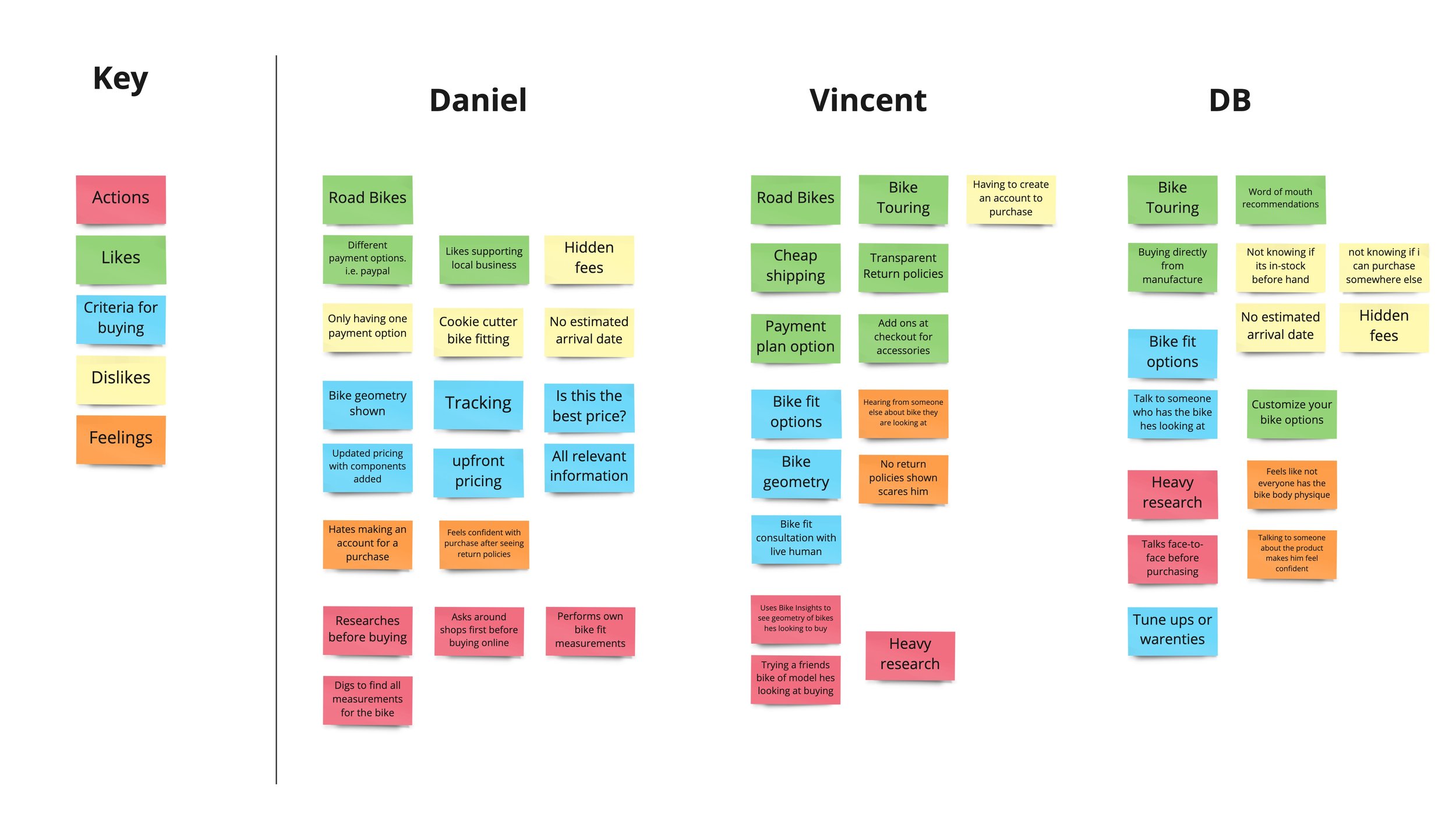
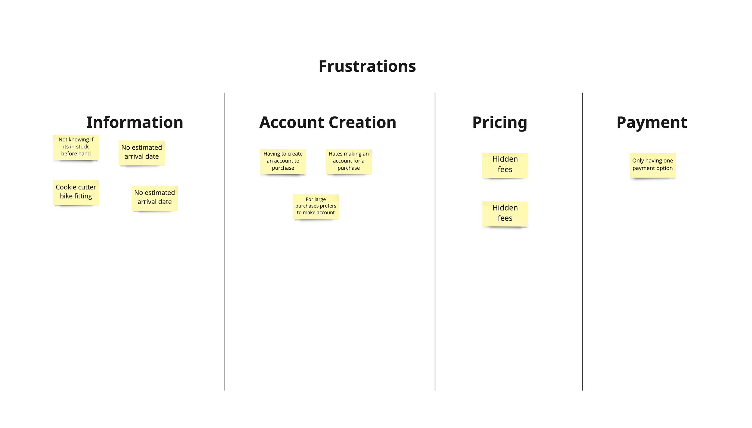


I interviewed three cyclists who have recently purchased a bicycle online. After these conversations, I put together 4 affinity maps that helped me determine the major pain points for my users. These major pain points were:
Product information: Not having all the information on the product was something these cyclists were most frustrated with. They wanted to have photos of the product, the specs on the bike, the price, the accurate geometry of the bicycle, and shipping information
Account Creation: Two of the three disliked having to create an account to purchase a product. They all agreed that they would like the option to create it and it should be integrated with the checkout process to not distract from the purchase of the bike.
Pricing: They all wanted to have accurate pricing as they were researching their purchase. They didn’t like when they had extra fees or once they changed a component the price was more than they budgeted for.
Payment: Each one had their preferred method of payment. One wanted to use PayPal to make sure that if he didn’t get what he ordered, he could cancel it and get his money back. Another liked having the option to break it down to smaller payments even if he had all the money upfront. The last one liked being able to pay with his credit card.
With this information, I was able to determine who my user was and create a persona.
Persona
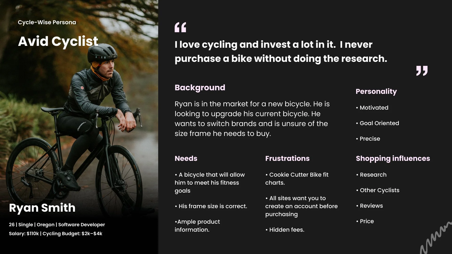
I then created user stories that Ryan would use in his journey to purchase a bicycle.
Browse
Checking the product information
Checkout
Most of the preliminary research is done before Ryan would get to the point of purchasing. At this point in the journey, he would have it narrowed down to one or two and would use the information on the product page to make the final decision.
Phase 2: Design
User Flows
Taking what I learned from my persona I developed a user flow that Ryan would go through to get to purchasing his new bicycle.
Wireframing Red Routes
I wanted to make sure that I was adhering to the scope of the project of no more than 90 hours total. To adhere to this, I found an e-commerce UI Kit on Figma. By doing this it saved me time and I was able to jump into lo-fi wireframes in Figma after my user flows. To make sure both company goals and user goals are aligned, I focused on these two main objectives for the project:
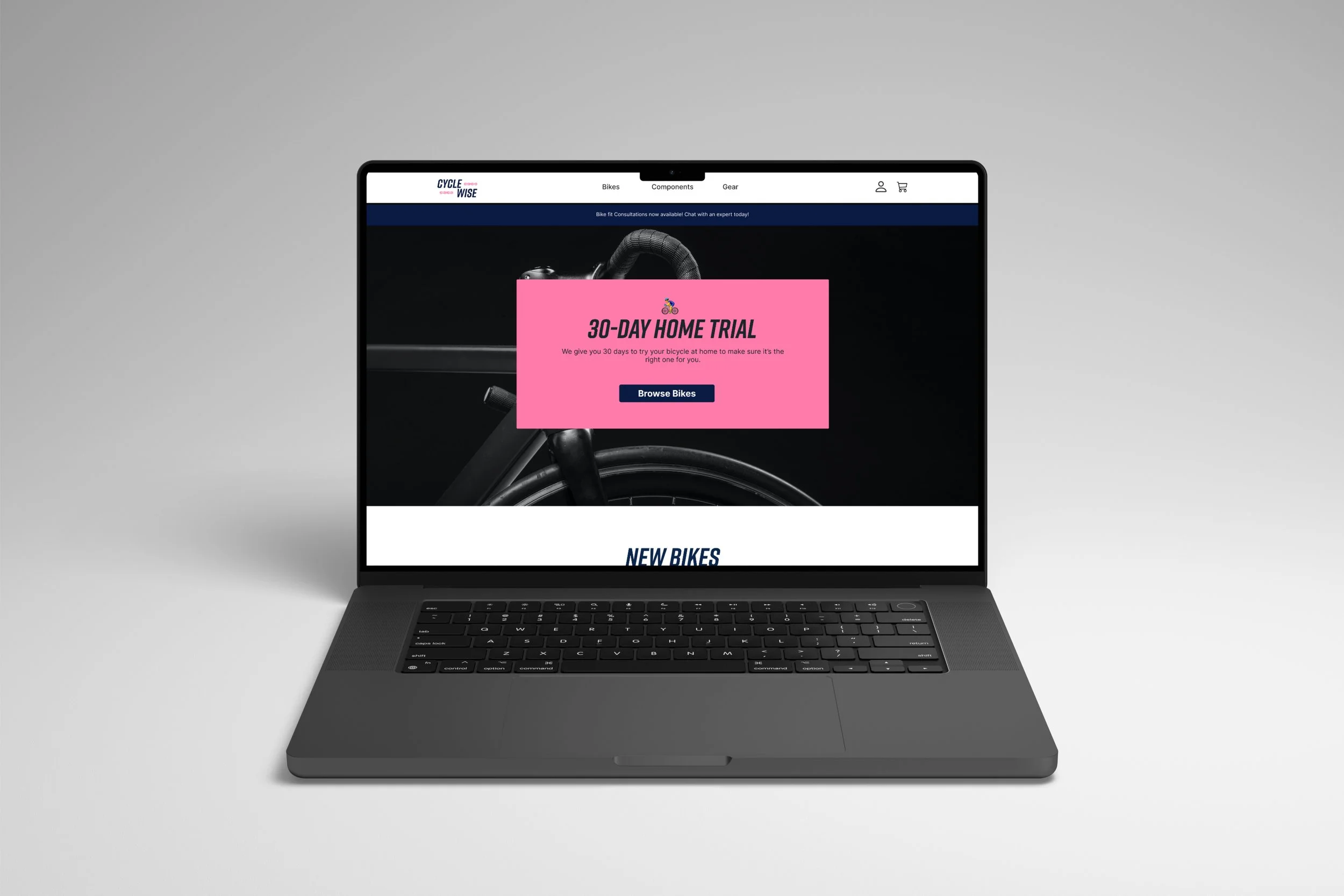
User Goals: Be able to feel confident in the next bike they purchase by giving them all of the information they need and ensuring they know Cycle-Wise has a 30-day Home Trial.
Business Goals: Cycle-Wise goals were nestled into the user-flows which is making conversions. I did this by making sure user needs were met.
Test Prep
I developed an 8-question interview script to make sure that the tasks were consistent for all participants. The tasks were to test the following:
Red routes - User Flows
Ease-of-Use - Usability
Page Layout - Information Architecture
Check-Out Process - Business goals of conversions made
Phase 3: Lo-Fi User Testing
For the first round of testing, I recruited five participants. The tests were done remotely on Zoom and lasted about 20–30 minutes. I began each interview with an overview of the project and sent them the link to the Lo-Fi wireframes to have them complete 7 tasks. Each completed the tasks while speaking aloud with their thoughts. At the end of each test, I gave the participants the opportunity to share their thoughts and ask questions about the project. It was challenging to find participants during the holidays so some of them weren’t in the original persona that I built. I don’t think that this swayed the outcome of the results though.
Phase 4: High-Fidelity Designs
Before I got started with designing high-fidelity designs, I reflected on the logo assets and guide I created for Cycle-Wise. This helped keep the colors, type, imagery and tone consistent with the Cycle-Wise brand.

I spent 15 hours on the first round of designs. I updated the components that came with the UI kit to match the branding of Cycle-Wise. While building the site I focused on the primary issues I identified in the lo-fi testing:
30-Day trial needed to be emphasized more
A product page with filters needs to be built
Bike consultation needed to be emphasized more
Bike geometry over cookie-cutter bike sizing


Phase 5: Hi-Fi User Testing
I recruited an additional 4 users for the second round of usability testing. The second round of testing was done in person and lasted about 20-30 minutes with each participant. It was nice to be in the room with the users and see how they responded to the prototype. They were all given 8 identical tasks to complete. At the end, I asked them their overall thoughts about the site and where they would make changes.

Phase 6: Final Design
I spent the last 5 hours of the project design time iterating changes from the usability tests. I wanted to make sure that the final highlighted the user’s ideas. After this, the project was ready for submission!

Project Reflection
I was pleased with the final result. Despite having issues with recruiting users for this project, I found that the users I recruited gave me information that otherwise I would have pushed me over the budgeted time for the project. This result met the needs of Cycle-Wise and improved the user experience.
Lessons Learned
Recruiting users-While working on this project, I feel that I extended my network to the max which made recruiting difficult. I also worked on this during the holiday season which was another road block to budgeting the allocated time for the project.
90 hours isn’t a lot of time- I was shocked at how fast 90 hours is. During this time, I found that I needed to speed up my processes and make decisions quicker. I believe this helped me not overthink the design decisions I was working on in the moment.
Give myself more design time- I found that I spent a lot of my time trying to recruit people and not enough time designing the product.