
CityPups
CityPups wants to connect people in cities with their perfect pup. They are a hub for organizations to share about adoptable dogs in their local shelters. Users will walk away with the confidence to adopt their furever pup!

Project Information
For this project, I followed the Google Ventures Design Sprint. This is a five-day project that focuses on a different part of the UX process every day. This is great for companies that are looking to add a feature to their app without developing a full-blown developed prototype. This allows for companies to work quickly without spending man hours and capital to make design decisions. It gets the product into its user’s hands fast and allows for a better product to be built.
Timeline: 5 days • My role: User Testing, UI Design, Prototyping • Tools: Miro, Adobe XD

Day 1: Mapping
CityPups wants to help people find their perfect pup. Most people in cities want to adopt a dog but have problems finding out that they feel confident they can take care of it. The major pain point for users is finding adequate information on the dog to see if they are the right fit for the dog. These folks are ready to adopt now so having the right amount of information for them to decide is the most important thing CityPups can do for users.

Shown above is my map. I set a timer for 30 minutes to make sure I didn’t overthink or add too many features to the end-to-end user map. After reviewing the persona and the research highlights, here are the pain points.
Bios aren’t detailed enough- they need to know the level of energy, how much space they need, whether they are okay with a city environment, etc.
Setting up appointments is difficult and time-consuming
Dogs’ personality.
Not knowing the actual size of the dog to know if they have enough room for them
Not confident in being the right fit for a dog
The two top issues are:
Not Confident
Not enough detailed information on the dogs.

Day 2: Sketching
For this stage of the Design Sprint, I spent an hour researching CityPups’ competitors by conducting a lightning demo. I spent some time writing the reasons I decided these were a good platform to research and get inspired by. From there I moved to the Crazy 8 exercise which challenged me to find the critical screens for my user.
Lightning Demo
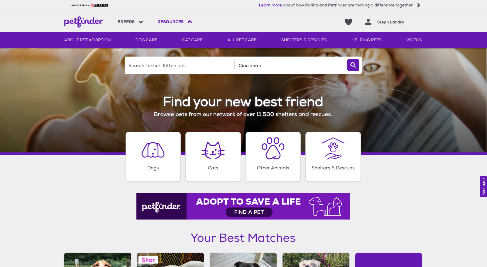


Petfinder.com is one of CityPups competitors. They have a questionnaire for when you first sign up to match you with the perfect pup. They give detailed info on their dogs, some better than others depending on the rescue they are coming from.
Based on your results they show dogs and label them to be a “good match”. I found this helpful for those who are browsing. This is also around even if you bounce around on different pages so you can still see a good match for you would be.
To the right of the information is an adoption button. I did find this a little hard to see/understand because there is a lot of purple around and ads.


Petsmartcharities.org uses adoptapet.com to gather their dogs databases just branded differently. However, I like that they have multiple views of dogs and their breed. You can learn more about the breeds as well. They call out their names more than the images so I found that interesting that they took that approach. One feature I thought was great was asking a group about the pet. It would help folks learn more about the dog itself and help someone figure out if this is the good match for them.
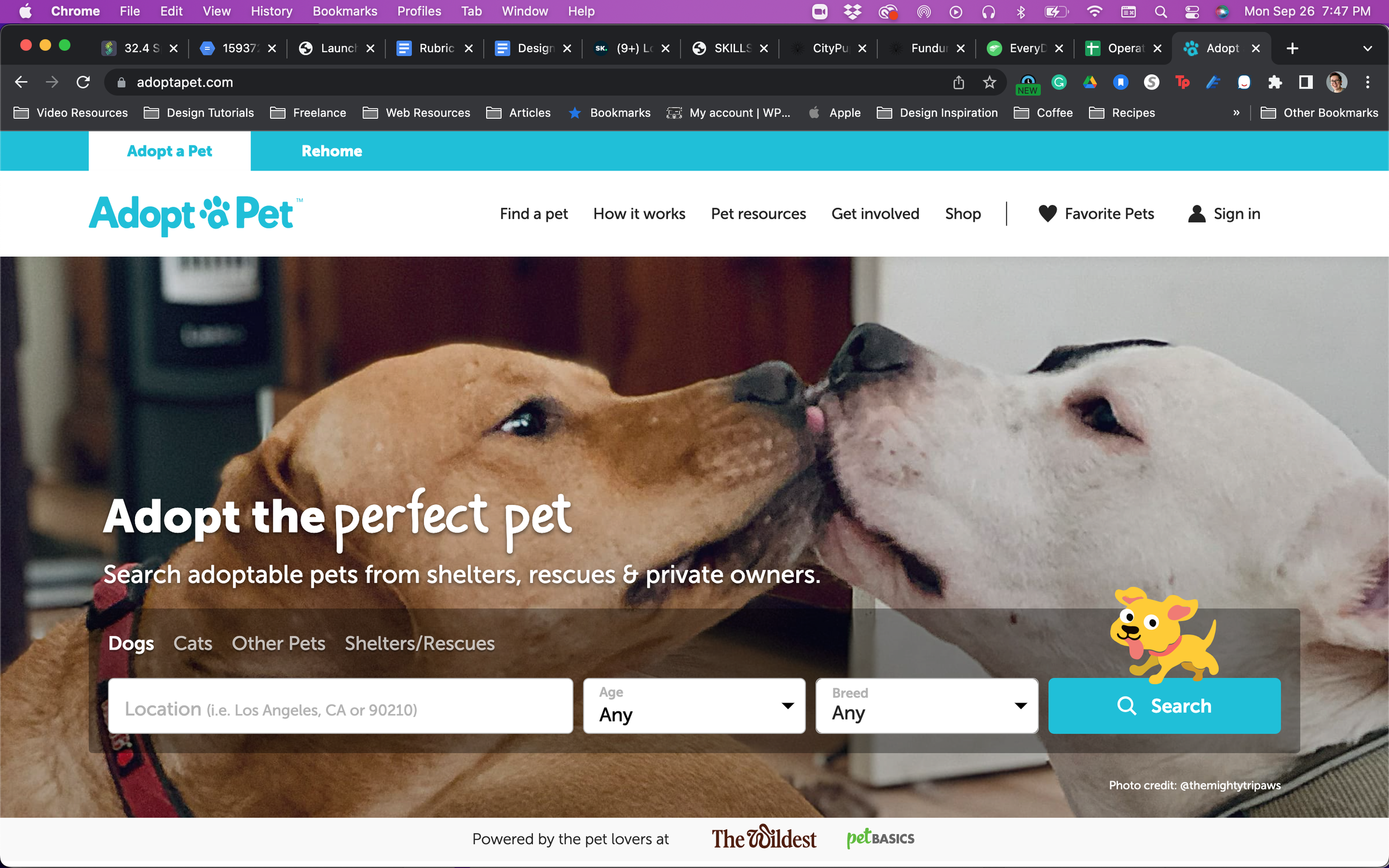


Adoptapet.com has a great filtering system. You can filter dogs based on color, size, breed, age, and more. Some people know they want a certain breed and others do base it on size. For our persona, she knows she wants a small dog.
Depending on the rescue/shelter that is taking care of these dogs, some have a ton of detailed information on the dog’s behavior and the type of home they need. If all adoption sites had this much information on dogs, I think people could find their perfect dog much easier.
Crazy 8 Exercise
During the lightning demo phase, I saw UX features that were repeated throughout the competitor’s websites. The one that stood out the most was their filtering process. They had extensive filters that a user could select to find their dogs. However, I felt that one feature from petfinder.com, namely their survey at the beginning, was the most successful feature of all of the competitors. However, they did lack information in the bios which was a major pain point for our persona, Ellie. I felt that if I:
Created a survey that collected the users desired pup with information including, desired weight of dog, activity and lifestyle information this would help users find dogs that match them.
Adding a chat feature that would allow potential adopters the ability to ask the shelter more situational questions that they had.

The Crazy 8 exercise helped me explore what this site would look like and helped me decide on the critical screens for our user.


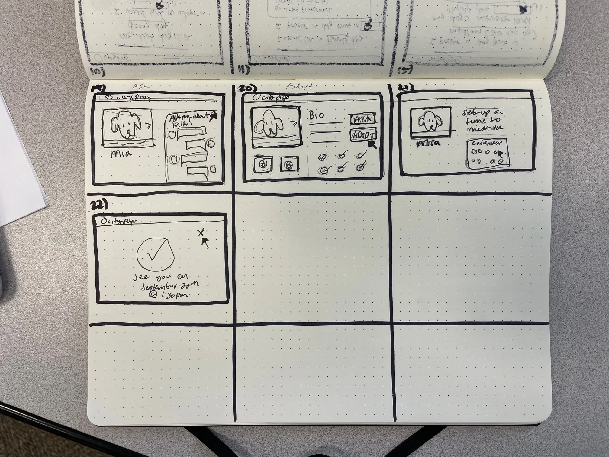
Solution Sketch
The solution sketch is structured like a 3-part storyboard, which allowed me to work through my ideas through the user’s eyes. I was able to see how they would walk through the site by using only the 3 main screens from the crazy 8 exercises. The page that was the biggest challenge was the dog bio page. Here are the reasons:
Bios written in a way that shares enough information and can connect to the user.
On-demand chat to find more information for situational circumstances could seem like a barrier to some.
Information hierarchy was something I wanted to focus on. I wanted the images and stories to be the first thing a user sees following, the chat and adopt buttons.

Day 3: Decide
Because I am working on this design sprint solo, I am going to stick with my solution sketch from yesterday. This is the best option based on the results of the interviews and persona. I wanted focus on finding solutions for their pain points.
Those pain points are:
Dog bio’s not giving enough information about behaviors.
No way to tell if a dog thrive in a small apartment.
Not having the confidence that the person’s lifestyle will match what the dog needs.

With this in mind, I decided that a thorough questionnaire that a person fills out prior to looking for dogs is the way solve this problem. Even if they don’t fill this out, the filtering system will help them find a dog that they will feel is the perfect pup for them.
Most of my storyboards are the difference questions on the screen. I will likely edit it down a bit and add some images/illustrations to help keep the page fun for users.


Day 4: Prototype
Today was spent creating high-fidelity prototypes for tomorrow’s usability testing. I have revised my storyboard a bit to cut down on some screens that I felt weren’t necessary. I borrowed some assets from Adobe XD plugins and UI kits on their site to help speed up the process a bit. I set a few timers for myself so I wouldn’t go beyond the time limit that I set for myself. I wanted to make sure I treated this as a true design sprint.


Day 5: Test
Today was spent testing with users to see if my solution was the correct one for the problem. These folks provided great feedback for me to help tidy up some of my designs. They felt the process was easy to walk through and liked the questions that were asked. They liked the idea of having a chat feature as well to ask what situation-specific potential owners could have. They liked the filtering system and all the information about the dog. Overall, users felt like this was an easy-to-use site that provided all the information needed for them to make their decision on adopting a dog.

Project Outcomes
The week flew by. I didn’t expect it to go so fast, but it was an amazing experience to walk through the Design Sprint. I thought that it helped me make quick decisions, not overthink things, and helped me improve my design skills.
Based on testing, I think the chat feature would be helpful, but most of my testers didn’t use it as a tool to help them find out if the dog was for them. I don’t know if it was because they weren’t ready to adopt a dog but looking into it in the future, this may have impacted them when testing the website.
The questionnaire at the beginning needs some refinement. Folks thought that some of the questions were redundant. For example, if the user’s apartment lease didn’t have restrictions on the size of a dog, why were they asked that? I think with some work and time, I could make this questionnaire more helpful.
Lessons
I enjoyed the pace of the design sprint. I wish that some of the phases allotted more time, but I was happy with how quickly I needed to run with an idea and not overthink it. I do want to tighten this up a bit if I were to present to a stakeholder, but overall, I’m impressed with the result in the time I had.